Saturday, 29 November 2014

OUGD405 Studio Brief 1 | Research & Interim Crit

From my first bit of research I found a particular illustration I liked that was part of the backing paper for a frame in Debenhams. 


As I said, I would look into this type of design except look at designs that interest me more; so I looked into geometric animals. First I just googled 'geometric animals' and got a good response from because as I knew it was quite a common design topic. 


I chose some of my favourites from this page and then went for more specific by looking at the suggestions above the images. After looking into these designs I had a go at it myself. 


-----------------INSERT PICTURES-----------------


Interim Crit


My interim crit was very helpful as it led me on a different path that led to my finished designs. First I showed that I had been looking into geometric design and more specifically, animals. The feedback I got on my research and the designs I had put together myself was pretty good as everyone liked them and said they could see them being a suitable image for backing paper. 
John said that the way the animals were made from single lines reminded him of a cage which made me think of how the animals and cages link together. He also said that 3 other people in the class were also looking at geometric animal designs which made me think I should maybe move away from this topic and look at something new. 

After this crit I went away from animals and looked at cages instead, but keeping to the geometric lines and shapes I had previously researched. 


Friday, 28 November 2014

OUGD405 Studio Brief 1 | Frame | Research

To gain some ideas on where to go with this brief I've started by looking online to see what there is to offer from a variety of shops and sites. I will later further this research by going into stores so I can physically see the designs in person so it will be easier to determine what I do and don't like. 
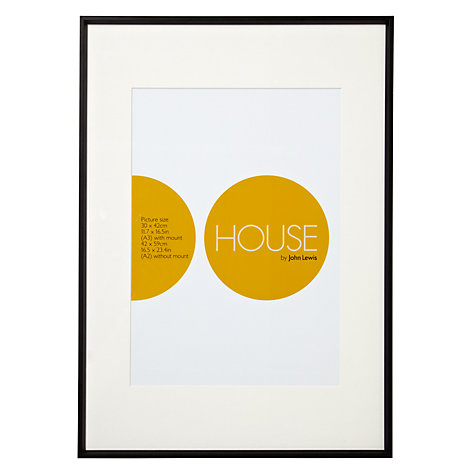
Buy House by John Lewis Photo Frame, Matt Black, A2 with A3 Mount Online at johnlewis.com


John Lewis

This design I feel is rather modernist in the way it's presented.  The decorative side to the design is kept very minimal with just two coloured circles; one full, one partially cut. Other than that everything is there for a reason: frame sizes, name of product and who it was made/designed by. 


Buy Vera Wang With Love Photo Frames, Noir Online at johnlewis.com
This is very different from the design seen before. Instead of a shape it's using a black and white photograph of Vera Wang herself. It has no information about what size it is.


Buy John Lewis Daya Photo Frame, 8 x 10" (20 x 25cm) Online at johnlewis.com
This is one of many designs where a quote has been taken and blown up to catch the eye of the consumer.


Debenhams

I think is a clever one as it shows a variety of types of photos that could be used, so it's relevant to a wider number of people. Although it's very decorative it doesn't have any information on the overall size or the size of the individual squares within the frame. 

I do particularly like the second to left on the bottom row. I like the simple shape design made from just lines with no colour . I will look into this type of geometric design. 


Friday, 14 November 2014

OUGD403 Module Evaluation

OUGD403 Module Evaluation 


Overall I think the work I produced for this module turned out rather well. Studio Brief 1 taught me how type can communicate a certain feeling or vibe through different shape . This could be weight, angles, x-height and many other characteristics. This led me into Studio Brief 2 where I learned how to take one design and develop it further to make a full alphabet. This lesson doesn’t just apply to type and letters, but will apply to any project where I need to see what designs will and won’t work as a finished product. The research I did for the first two briefs helped me with Studio Brief 3 as it was all purely research based. Although I had done research before this brief it was not as extensive as it was for Brief 3. This brief required us to know the ins and outs of a chosen news story well enough that we could present it to our peers and they would clearly understand the story, the issues behind it and how and why it was reported. My chosen story was rather interesting as it was a very current issue involving Russell Brand, I chose this story as I thought I would be able to get a lot of research done while still be interested in the story. I was glad that I chose this story as for Studio Brief 4 we had to visually communicate a message that derived from our research from the previous brief. I had a lot of initial ideas but thanks to crits I was told that I should change paths, and I’m glad I did as I was very happy with the posters I produced. 

The feedback I got throughout this module was very helpful to me in making sure I got the best possible outcome. Although not every suggestion was great, it took me in a different direction where more ideas could stem from. Crits were the best place to receive feedback but just simply being in the studio and talking to my peers gave me some great ideas also.


I have learned from this module that preparation and planning is the best way to keep up with work. In the future I will keep on top of my blog daily and document every bit of development as during this module I have lost key design decisions due to not screenshotting or saving certain documents.

Thursday, 13 November 2014

OUGD403 Studio Brief 4 | Evaluation

Evaluation

I really enjoyed Studio Brief 4 as it was a chance to convey a personal message through our work for the first time.

When I first started designing my posters I was looking into 9/11 and I was going down that route, but thanks to the interim crit I got told to stay clear of that as it didn’t relate to my research as closely as the media did. I think this is where I went wrong with this brief; I was designing before I knew what it was I was trying to say, but then I was then helped by my classmates to find a new path to go down and the idea of the media  changing people’s words for the benefit of their sales was much more suitable. Once I knew where I was going with it I had a clear message  that made it easier to design than before. 

A challenge that I faced during this brief was with the colour restrictions. As  I did an illustration of Russell Brand it would have looked much better with a wider range of colours but  I had to make sure I stuck to the brief and only used two colours and shades of those colours. I overcame this challenge in the end by simplifying the illustration so less colours were needed.  In the end I think the illustration worked out rather well as it got the likeness and  people knew it was Russell Brand straight away despite the simplicity of the face and the features.

Another aspect I thought worked well was the use of acetate. By adding in this stock it allows the audience to interact with the poster which will make it stand out from the rest. The reason behind the acetate is it lets the viewer of the poster physically uncover the truth of the story, and reminds them that not everything the media says is 100% correct. 

OUGD403 Studio Brief 4 | Developed Ideas

With this design I’ve taken one of Russell Brand’s quotes from the Newsnight interview. The quote would be printed onto paper/card, then the black blocks on acetate. Then, when the acetate is placed over the card it blocks out some of the words he said to make a completely new statement.
The initial idea came from how the media constantly change what people say and how they take words out of context. 
I then looked into ‘redaction’, this is mostly used on classified documents but it is where certain bits of information are blocked out with black marker. This deign uses black rectangles to replicate the marker used and gives the same effect,.


I could also do the opposite to this idea by  instead of having sections   of blocked out text, have the whole page blocked out with windows showing certain words.


The idea where the doodles lie over the Russell Brand illustration/picture comes from the thought process that the media made his comments out to be worse than they really were. I feel that people don;t really know what Brand is trying to say or do, but just presume he’s wrong due to the constant bad press about him. 

The look of the idea came from when people doodle over newspaper pictures often of people they don’t particularly like.

This poster would be best as the image only poster as I don't think any text would be needed and don;t think it would add any more explanation. The overall message behind this poster is quite clear in my opinion; the media made Russell Brand out to be evil (the Devil) for saying what he thought about 9/11, but when you look into it it wasn't that bad. This is why I think acetate would be best for this as it lets the viewer physically ‘uncover’ the truth.


OUGD403 Studio Brief 4 | Interactive Posters

I thought that making the poster interactive would make the viewer remember the message for longer than just glancing at it then moving on to glance at another poster. But before I go ahead with and make a decision, I did some research into existing interactive posters.

The first example i found was on Behance and was a poster series for 'Do No Harm'. Here is what the designer had to say about the project: 


"This series was developed for a non-profit "organization" that I personally respect; it's message is simple – promote doing as little to no harm as you can, in your own way. The message is intentionally vague to promote imagination and personal responsibility. This was naturally my objective with these posters, the passerby would stumble upon these posters in subways, schools, alleys, etc and be encouraged by it's simple message and interactive tone."


Out of the set, my favourite idea is the word-search one. This is because it is instantly recognisable as word-search and almost everybody has done one in their life, so it is relatable to all. Not only is it clear what it is, it makes people want to interact, if I was to walk past this I would stop and look even for just a couple of minutes.

https://www.behance.net/gallery/4146553/DO-NO-HARM


This is another I came across, although the message is very clear, I'm not sure if it's or a certain organisation or company. The idea is as you unfold the packaging and get rid of all the dirt the message becomes clear; "The future belongs to those of us still willing to get our hands dirty.”
This message is only visible once all the dirt has gone and is then on your hands, which is fits perfectly with the message.


"An interactive poster designed to promote our first lecture at Norwich University College of the Arts. The poster featured the Designers Anonymous censor strip logo followed by 'reveal all'. The censor strip is made up of a series of perforated tabs. As the tabs are removed our name is gradually revealed. Each tabs contained the lecture details on reverse."
Designers Anonymous - Designers Anonymous


This poster is slightly out of my capabilities for the time being but consists of a piece of wood and pre-cut pieces that make up a chair that can be assembled.

Kit Kat Poster Chair

OUGD403 Studio Brief 4 | Interim Crit

The interim crit was overall very helpful to me as it was made clear that what I was looking at didn't relate to my research closely enough. My initial designs were all to do with 9/11 due to Russell Brand's 'open minded' comment on the matter, but after discussing with the group I realised that my research was mainly about how the media made the whole thing a bigger deal than it really was and took Brand's words out of context.

Some fo the suggestions that were made were very helpful as I essentially needed to start from scratch with my ideas. One of the best suggestions was to look at Cassetteboy, an artist(?) that takes people's words out of context to create a whole new meaning. 

This went on to the idea that I could take famous quotes and replace words or take words out to make a new one and see what people's reaction would be, whether they would believe this person said this new quote or not. I like this idea but I think it can be developed to something more interesting and related to my news story. 

OUGH403 Studio Brief 4 | Initial Designs

Brand said he found the links between the Bin Laden family and the Bush family very interesting, after I looked into these links I wanted some way of showing that they have been linked together through one way or another in the past  (before 9/11). To do this I created the shown image on Adobe Illustrator, I took inspiration from playing cards and poster designs that can be flipped to show something else. The message behind it is that there are links but also that they are opposites when it comes down to it.    


This image has a background that is meant to represent the American Flag. Within the flag I have coloured two of the stripes to make the twin towers. This message is about how the US government could have been linked and intertwined with the plots and it was an inside job. The smoke that is coming from one of the towers is covering up where the blue would usually be on the flag which then makes the colours red, white and black; black being the colour of death and grief.  I do like this idea I’m just not sure how it easily it communicate the message I was trying to get across. It’s obvious it’s about 9/11 but is it obvious that it represents the government being part of the attacks?


This idea to the right looks good visually, but I think it may be seen as offensive.  This was not my intention at all , the idea behind it is that a lot of blood was shed that day and many people suffered due to the attacks. Between the dripping blood the twin towers can be seen , this is quite clear as to what it is primarily about and grabs the viewer’s attention straight away. This would d have been image only.


This is just a quick idea that a poster could develop from. It is just a dynamic view of the towers which I think is pretty interesting. I also think this would work well for the text and image poster as text could go behind the illustration of the towers.

Sunday, 9 November 2014

OUGD403 Studio Brief 4 | Poster Design | 2-Way Posters

I've looked into posters that can be seen in two ways, weather that be rotating the poster or some other way. I think this could be relevant to my issue at hand as I think it could show the two sides of the 9/11 attack and Afghanistan war.

Here are some examples of what I looked at:

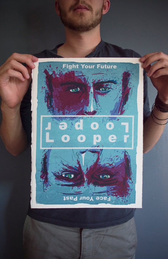
Looper
This poster is inspired from the 2012 film 'Looper' and is appropriate as in the film the past and present are intertwined and there is a battle between Joe and him future self. There are two main title texts either way up along with the tagline where half is one way up and the other half the other way up. This lets the buyer choose which way round they want the poster to be.


Looper Movie Poster, 11"x15" Screenprint Art Print

Another Looper example

The Amazing Spider-Man 2
This print was designed from The Amazing Spider-Man 2 and shows both Spider-Man and Electro. The difference between this image and the previous one is the two pieces of title text, (one to represent Spider-Man, one to represent Electro) are on the same top/bottom section of the page rather than in the middle. The use of colour is very important in this image as the designer has used red and blue which are often associated as opposites and then combined them into one 'face', then the title text is also representative of each character.


Batman vs Superman
The designer for this poster says he wanted a poster that could be hung either way depending on who you preferred and as friends argued as to who would win in a fight. Again, there are two copies of title text, depending on which way you have it.

Fight Club
This illustration by Mike Harman shows Tyler Durden and The Narrator in the style of a playing card. This doesn't have any type other than the Ace symbol which contributes even more to how it could be viewed either way up.

Glow in the dark ink.

Another way a poster can be seen in a different way is by using glow in the dark ink, so when it goes dark, additional features are shown or even a completely new image. A gallery called Bottlneck Gallery which I follow very closely have done a couple of exhbitions called 'When The Lights Go Out'. This exibition consisted of film and TV posters that used glow in the dark ink to add effect to the prints, here are some of my favourites:


Donnie Darko
'Going off on a Tangent'
Florey

The Shining
'Some Shine and Some Don't'

Breaking Bad
'Get Back to Work'
Tim Anderson


Saturday, 1 November 2014

OUGD403 Studio Brief 4 | Poster Design

Poster Design


I'm very interested in poster design and film posters in particular. This interest started when I discovered alternative film and TV posters, this is where artists make their own design for a poster, which is usually more artistic, stylised and specific to the designer's take on the media. I took my interest further by looking at the many designers that do this not only as a hobby but also make a living out of it. Galleries such as Mondo, Gallery 1988, Bottleneck GalleryPhonebooth Gallery and many others do whole exhibitions dedicated to a certain film, or TV show, or a certain genre, or a certain actor. Some of the designers I'm most interested in are Olly Moss, Kevin Tong, We Buy Your Kids and Anthony Petrie, but I also follow many lesser known designers on Behance. Not only does Behance let me follow many artists that produce work that I'm interested in, but also lets me publish my own work and get feedback from people who who make similar work. I have done posters for many shows and films such as: True Detective, Enemy, Gravity, Game of Thrones, Inception, Donnie Darko and many others, which have all taken influence from the designers mentioned.

These posters are a few that I really like, and some that I actually own, The artists that produced these in order from top to right are; Olly Moss, Anthony Petrie, Ty Mattson and Godmachine. 

These designers use mostly vector based images to create their prints, with the additiono fpainting in Photoshop for gradients and shadows, The vector side is what interests me more, as they are able to create such likeness of characters and places using flat shapes, often layered on top of one another to create the effect of shadows.


The images above are all created using Adobe Illustrator by artists on Behance