Here are some examples of what I looked at:
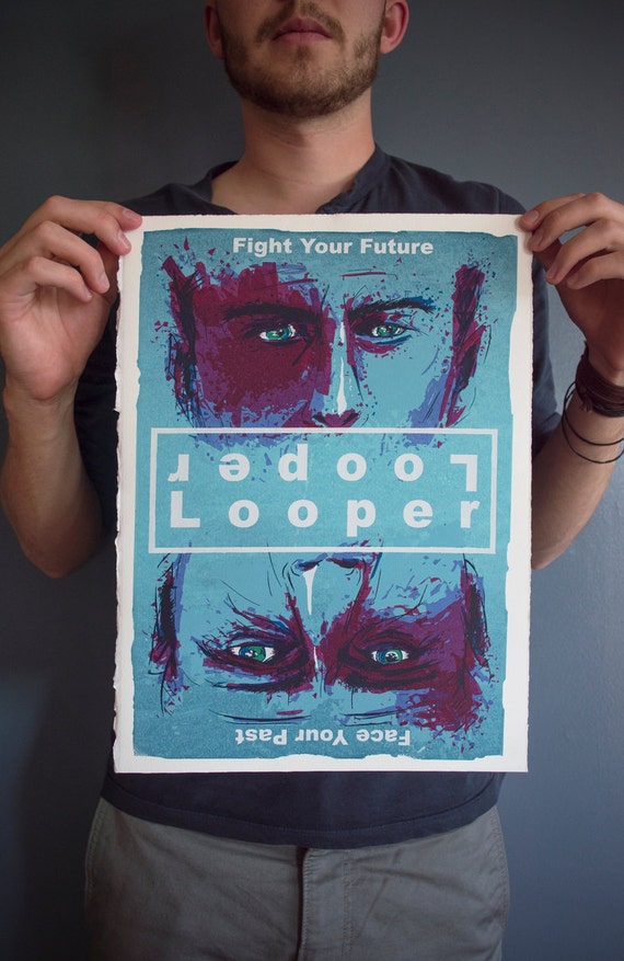
Looper
This poster is inspired from the 2012 film 'Looper' and is appropriate as in the film the past and present are intertwined and there is a battle between Joe and him future self. There are two main title texts either way up along with the tagline where half is one way up and the other half the other way up. This lets the buyer choose which way round they want the poster to be.
Another Looper example

The Amazing Spider-Man 2
This print was designed from The Amazing Spider-Man 2 and shows both Spider-Man and Electro. The difference between this image and the previous one is the two pieces of title text, (one to represent Spider-Man, one to represent Electro) are on the same top/bottom section of the page rather than in the middle. The use of colour is very important in this image as the designer has used red and blue which are often associated as opposites and then combined them into one 'face', then the title text is also representative of each character.

Batman vs Superman
The designer for this poster says he wanted a poster that could be hung either way depending on who you preferred and as friends argued as to who would win in a fight. Again, there are two copies of title text, depending on which way you have it.

Fight Club
This illustration by Mike Harman shows Tyler Durden and The Narrator in the style of a playing card. This doesn't have any type other than the Ace symbol which contributes even more to how it could be viewed either way up.

Glow in the dark ink.
Another way a poster can be seen in a different way is by using glow in the dark ink, so when it goes dark, additional features are shown or even a completely new image. A gallery called Bottlneck Gallery which I follow very closely have done a couple of exhbitions called 'When The Lights Go Out'. This exibition consisted of film and TV posters that used glow in the dark ink to add effect to the prints, here are some of my favourites:
Donnie Darko
'Going off on a Tangent'

The Shining
'Some Shine and Some Don't'

Breaking Bad
'Get Back to Work'

No comments:
Post a Comment