Friday, 24 October 2014

OUGD403 Studio Brief 3 | Evaluation

Studio Brief 3 was purely research based to prepare us for Studio Brief 4. This brief taught me many things about research and investigation into a certain topic, such as where to start looking. The brief told us we had to choose a story from the papers that were published on  25th October 2014, then look into that story as much as possible to get a strong understanding of what went on and from different points of view. 
From there we could look at other papers whether they were regional, national, international, we just had to find similarities and differences on how it was reported and discuss why we thought this might be. For this brief it was a requirement to start at newspapers but for future briefs where research is needed I will definitely start or at least look at the press as the many papers give many different view points, which is exactly what were need to look for. 

I then chose to move to the internet and more specifically; Twitter. This proved  to be helpful as there were so many results for ‘Russell Brand 9/11’ which gave me a lot to work with, The only bad thing about this is that there were lots of annoying links such as ‘8 more reasons you should hate Russell Brand’. If I were to do a similar research brief again I wouldn’t put my focus onto Twitter. Although it was helpful in a  lot ways, it took a lot of time scrolling through the tweets to find a genuine opinion on the mater at hand rather than just saying why Brand is such a fool. 


This brief has shown me that there are many ways of getting information and many ways of getting other people’s opinions. I now realise how important research is in a brief in relation to the visual side.

Study Task 3 | Newspaper Layout


My group's story was on how an art fraud painter made over 50,000 at auction.


This was our original layout that we decided on through an hour or so of discussion and experimentation.


After the crit we were told that the blue used looks like the blue the NHS use and it looks too much like a leaflet. A suggestion that was made to correct this maybe and make it more interesting was to put a quote in the columns. 

Final Outcome:

Wednesday, 22 October 2014

OUGD403 Studio Brief 3 | Research


What did Russell Brand actually say?
In the interview with Evan Davis on Newsnight Russell Brand went on to talk about how the public needs to come together to fix the errors in society. Rather than speaking about this in full I feel Brand was pushed by Davis to speak about topics that would cause controversy, which has been noticed by The Times as they said that Newsnight were ‘chasing viewings’. Brand himself said that he is no revolutionist or anything special, in fact near the start of the interview he said politicians can’t be trusted and stated “I’m not suggesting they start trusting me, an entertainer, I’m a comedian who looks like Jesus”. So I feel that Brand is very self-aware and realises that the politicians and many others won’t take him seriously due to his profession but “as an entertainer, as a comedian, can use [his] voice to amplify people pursuing just-causes.”

The issue of 9/11 comes into play when Davis goes completely off topic and quotes Brand from his book suggesting that the attack on the twin towers was an inside job. Brand goes on to say he’s “open minded” to many possibilities and    questions Davis on whether he trusts the US or British government. When pushed further with a direct question, he responds and tells Davis that he doesn’t “want to talk about daft conspiracy theories on Newsnight”, something that many articles left out of their reports.

Twitter
To get some public opinions on this topic I went to
Twitter as I feel this is a place where many people voice their views whether people want to know them or not. To do this I simply searched ‘Russell Brand 9/11’ and got thousands of results dating back to when the Newsnight interview first aired. The vibe I got from most of the Tweets is that people don’t particularly like Russell Brand, and even more so now. The celebrity turned revolutionist is getting widely accused of purposely being controversial to promote his new book; ‘Revolution’, but I think this is unfair as he clearly stated he didn’t want to discuss the “daft” conspiracy theories, yet he was pushed into voicing his thoughts on the issue then being criticised and mocked for what he believes.

On the other hand I did spot a few tweets saying that Brand was “brave” for saying “what needed to be said”. This opinion is definitely the minority but it shows that Brand isn’t completely alone in thinking 9/11 was an inside job, and that his ‘followers’ or supporters think it’s good that someone with a high profile has come out and said what many think.

Newspaper Headlines

"Another ‘Newsnight’ interview, another row as Brand tries his hand at 9/11 theorist." -The Independent

The headline to this article sets up the tone of voice and views of the writer straight away as it almost makes a joke about Brand and what he said. The term ‘tries his hand’ makes out as if it’s a new career path he’s chosen; to add to the list of comedian, actor, presenter and revolutionist. The article focuses on how he doesn’t trust the US or UK government, and how he is ‘open minded’ about who was behind the 9/11 attacks. It also touches upon how the day after the attacks he went into work at MTV dressed as Osama bin Laden, trying to reinforce how wrong Brand is and how he can’t be taken seriously as he has no compassion for the victims or the families.


"Don’t put all your faith in Russell Brand’s revolution." -The Guardian

This article is without a doubt against Russell Brand. The writer compares him to a power-mad leader from Woody Allen’s 1971 comedy ‘Bananas’, and keeps this reference going throughout the text. Apart from the little section on his 9/11 views, described as ‘blathering on’, it’s mostly about how little knowledge he has about real world politics or what he’s really talking about. Lacking in ‘specifics’, ‘ability’, ‘judgement’ and being able to ‘listen to people other than himself’ he does get credit for ‘making politics seem sexy to teenagers’. This comment is very insulting to Brand I feel, as it suggests his views and ideas are only appealing to that of the younger generation who are possibly not experienced enough to realise what really needs to happen in politics for the country to work. This could also be linked to how the writer described Brand during the interview, with words such as ‘funny’, ‘bright eyed’ and ‘dizzying’, makes him come across as an excited teenager, rather than a grown man trying to get his thoughts and views heard.


"Newsnight attacked for Brand interview on 9/11 conspiracy." -The Times

This articles differs from the other two and from anything I’ve read online. This is due to the fact instead of criticising Brand for what he said, they focus on how Newsnight has been critised for using Brand to boost ratings. The Conservative MP Philip Davies said that the interview was “rubbish” for such a serious news programme. It also has the other side of the argument with BBC defending the interview saying that Brand is able to voice the “anti-politics mood that all British politicians are currently struggling to engage with.” This is the most informative, fair piece of writing on the matter that I’ve seen so far due to the fact it doesn't complain about Brand’s views or what he may have said or done in the past, it just informs.

Tuesday, 21 October 2014

OUGD403 Studio Brief 2 | Evaluation

Overall I think this brief turned out well. I believe I kept to the restrictions and submitted the deliverables accordingly. 

I think this brief went well because almost all of the research and development was done in Studio Brief 1. All I had to research for this brief was grids for layout and type and that proved very useful to me.  This allowed me to understand how to apply a grid to my letterform and how it would help re-produce it. Although I did this at the end I didn’t actually use my grid as I found it more complicated than just doing it  manually and following my own rule. My rule was moving one of the two letterforms over a certain amount. Th actual measurements varied depending what size I was working with but I got around this by starting on the same size canvas and scaling it up depending on where I needed it, making sure I kept scaling effects enabled. 

If I were to re-do this brief there would only be a few minor things that I would change. One of these being that I would establish my rule earlier on, rather than designing them all on one size canvas, saving it, then forgetting how I did it. In the future I will definitely learn from this. 


Another being  I wouldn’t leave it so late to print off my final piece. Printing earlier would allow me to review it and alter anything I didn’t like once it was printed onto stock. 

Monday, 20 October 2014

OUGD403 Studio Brief 2 | Final Crit

The final crit for this brief told me that I made a good choice when deciding which letterform to take forward from Studio Brief 1.

OUGD403 Studio Brief 2 | Interim Crit

The interim crit told me a lot of things that will help me further develop my typeface. One of the points made was to experiment with different weights, this could be certain lines within the letter-form or just the whole thing in general. This point was then made specific to a certain design of mine as the group thought it would look better if it was thinner. The font that came out with the best feedback was the one with the doubled up letters. The group said this most represented 'violent' due to the sharp points and lines, and could look even better if the weights were changed.

One other thing that got said was maybe adding colour to certain lines would be interesting.

Sunday, 19 October 2014

OUGD403 Studio Brief 2 | Grids

A grid is used to put together content on a page easily and consistently in a manner that makes it visually appealing. This is done by dividing he page into vertical and horizontal margins, columns, inter-column spaces, lines of type, and space between blocks of type and images.

 Just to get an idea of how grids work in practice, I drew up the grid layout for this newspaper by tracing where the columns begin and end, where paragraphs cut off and where the image lies. As you can see everything is in a grid; the left side of the picture is aligned with the centre of the column on the right, the large text under the image is aligned along the top with the start of the same column and so on.

Some common grids are:
Multi-Column Grid


Modular Grid


Baseline Grid


Grids aren't just used for page layout, they're also used in icon design, logo design, fine art, product design and in almost every other design or creative field you can think of. For example; an Apple App icon is something millions of people see everyday and the grid that is designed to design those icons is fairly simple, but is able to produce extremely intelligent and aesthetically pleasing designs through the structure, this could be due to the 'golden ratio'.

iOS 7 App Icon Grid System
The 'golden ratio' is a theory or myth that is believed to be the most pleasing of all the ratios. It is not only seen in art and design but also nature such as hurricanes, spiral galaxies, flower petals, and sa shells, amongst many other 'examples'. 


Saturday, 18 October 2014

OUGD403 Studio Brief 1 | Evalutaion


Evaluation


I am happy with how my final designs have turned out despite a few difficulties along the way. I'm also rather pleased as when I first received ‘violence’ as my word I was unsure on how to approach it and how I would be able to communicate it through type. I think the key element that worked well with my letterforms were the sharp points and edges judging by by feedback from the two crits and from just discussing work within the studio. This was pleasing to hear because this was my preferred route to take for Studio Brief 2. There were a few parts of the outcome I’m not as happy with such as the brush strokes letterform due to the fact it looks a bit cheap and almost a gimmick font. Other ideas I explored that didn't work so well were the obvious options such as making the letters out of weapons, or blood dripping off the glyphs, but I scrapped these ideas straight away as I made a clear choice not to make my typeface so cheap and obvious at the start. I faced a few challenges during this brief such as trying to create enough content that would be suitable to supply sufficient feedback. At times I would be stuck for an idea for a long period of time before realising what could be done next, I got round this problem by constantly tweaking Futura and other designs to see what could be created. I will do this for future briefs too as it sparks ideas, but I think more sketching would have been helpful. During this brief I wish I had done my hand-rendered work. I avoided this because I wanted the letterforms to be very precise and exact, and if I were to draw it it wouldn't come out perfect. Now, I realise this doesn't matter for interim crits and general idea generating.

Friday, 17 October 2014

OUGD403 Studio Brief 1 | Final Crit

For this final crit I presented my work on A3 pieces of card for clarity of communication. On each piece of card was one or more 10x10cm design with notes on how and why I made certain decisions on how it looked and why it represented 'violence'. The layout of the design sheets went down well as people commented on how it was easy to follow and read, but it still looked visually appealing.

The presentation went well as everybody was able to read clearly the process behind the fonts, as I passed round the pieces of card around the group. The thing I did struggle with was finding something to say about the font that either wasn't already on the card or was helpful or meaningful. In the future I will plan ahead what could be said or talk more openly about my thought process on how I got to that stage rather than just having it in writing.

The feedback I got was good as Simon said it was a strong presentation with the right amount of writing on for the occasion. This is because I didn't put on too much text and then bullet-pointed the main points that needed to be understood; as it was passed round the group each member wouldn't have a long time to sit and think about it so the bullet-points told them quickly and efficiently. I would do something similar to this style of presentation again as it was a clear and simple way to communicate my thoughts and processes in a way that made sense.

OUGD403 Studio Breif 1 | 'Violence' Research | Films


As a lot of films nowadays are classed as violent due to guns and fighting and other things, I thought for my research I would get the most from looking into more gory films such as various slashers and films such as Saw, The Hill Have Eyes, Hostel, Jeepers Creepers and other films that fall under similar categories.

I thought that this string of research would be quite straight forward the movie poster fonts would be fairly similar but I found that many posters ave completely different ways of showing the same style of film.

Saw

For example, with Saw the type used is a fairly basic typeface but each letterfrom is a different size and at different distances apart from each other. I suppose the reasoning or this is that it may subconsciously unsettle the audience of the poster. I also believe it links to the idea that the letters have been mis-matched, like they've just been cut or gathered and shoved together to make the appropriate word, which would be suitable to the film and it's themes.
The addition of colour and especially red adds a sense of danger and violence to it but even more so the way it's so subtle and underlying, as if to represent hidden danger. The lines that are used as a decorative feature look to me as if they add motion. I can imagine this to be jittering about violently.


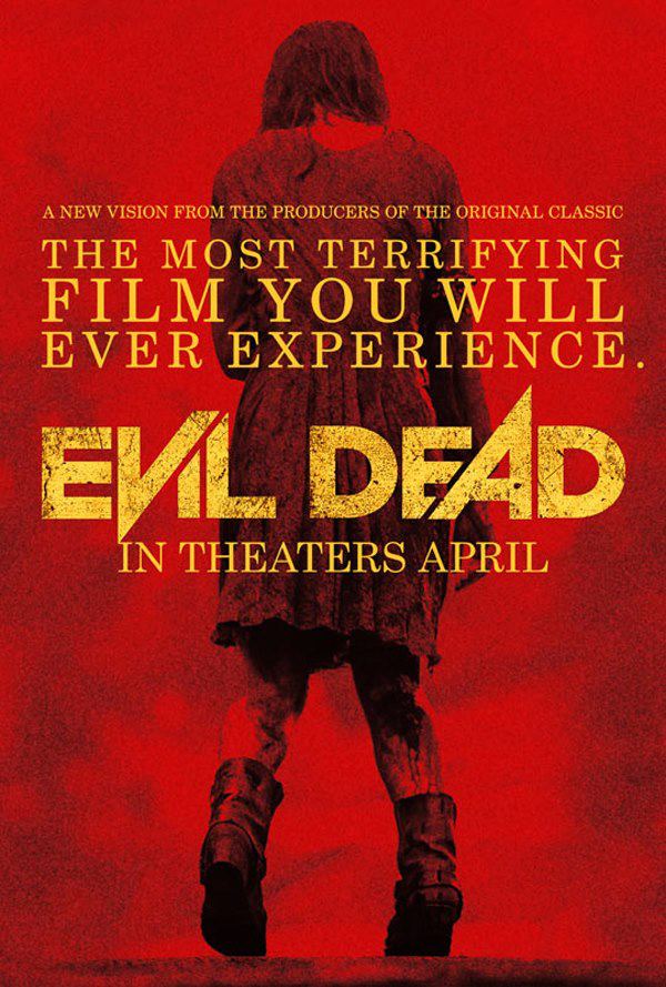
Evil Dead

With this poster the type has points where it overlaps and cuts through itself, something I found when looking into heavy metal album covers. I personally do see violence represented in this font for a few reasons one including the overlapping and the cuts. This is because I think it's almost as if the V and A letterforms are destroying the others around it or overpowering them. I think this is something I will definitely be looking to use in my designs. This idea is good because there is lots of room for experimenting, as the letters could cut across each other, or itself or like the example here raise high above or far below the rest of the letters to again show how powerful they are. As well as the physical shape of the font the texture and colour play a huge role in this poster. The grungy texture overlayed onto the type gives it a rough kind of feel, which is suitable for the film as it's almost like it has been buried or something similar. The use of yellow on red is very dramatic as those are both warning colours , straight away you get a sense of danger.


The Hills Have Eyes / Trajan

Like almost ever other modern day horror film 'The Hills Have Eyes 2' poster uses Trajan, This type doesn't exactly say 'violent' or 'scary' to me when I see it and that's why I'm looking into it.
This font is used for literally hundreds of horror film posters such as The Conjuring, A Nightmare On Elm Street, The Last House on the Left, The Cabin in the Woods, Sinister and many more.None of these films have done anything exceptionally different with Trajan each time they use it so what makes it suitable? I think it's because of the classic, traditional style the font has, the neutral feel to it allows it to be used on horror posters and look good, where as a sans-serif such as Futura would look hugely out of place. I also think that if a film were to make a typeface that has blood dripping off it or a ghost in the letter O, it would come across as cheap and would put people off seeing it, and now people have become so accustomed to seeing Trajan whether they know it or not, it's just the safe, reliable option.  


Overall horror film fonts don't seem to have many styles or characteristics that are common, except for the use of Trajan. Other than this, it seems to be individual to the film what the designer does with the type and how they think the feel of the film will get communicated to the viewer. Things I will take away from this research is that certain letters could be more powerful than others or different letters can cut and overlap one another, as seen in the Evil Dead type. The fonts used in many of these posters aren't as bold and strong as I would have liked, which is a contrast to heavy metal album titles.

Thursday, 16 October 2014

OUGD403 Studio Brief 1 | Yeezus

I have already looked into hip-hop albums as a whole but one I have kind of focused on is Kanye West's 'Yeezus'. This album is hip-hop but also goes on a tangent at times with heavy electronic synths and bass that really stand out. Kanye's rapping on this album is different to his past work as this album is a lot more aggressive and violent, which is also helped by the production.


This logotype is Ariel Bold with two dagger-like points dropping below from Y and the S. I presume these spikes were inspired by a weapon of some sort as the they are in the shape of some sort of blade. This is exaclty what I have been looking into and it has been inspiring my designs.
I took the idea of this logo and adapted it to suit this brief:


OUGD403 Studio Brief 1 | 'Violence' Research | Album covers

Heavy Metal

First off I looked into heavy metal album covers by simply using Google Images. I thought this would be a good place to start as heavy metal is often described as ‘violent’ and ‘aggressive’, so I was expecting to find that the band’s logotype and/or album title font would portray this and have a font that shows the violent nature of the music.

Straight away I could see the similarities between the fonts used, they were sharp, pointy and jagged. Overall this made for bad readability, but I think that they wanted the tone of music to come across more than the ability to read the lettering. I feel the reason behind all the points and sharp edges is because weaponry such as knives, axes and swords are all associated with violence, therefore by bringing in similar imagery and characteristics of those weapons the connotations carry over to the font. As well as shape a lot of bands used chrome and metal as a texture for the font and i believe this is again linked to weapons such as knives and the ones mentioned earlier, due to the fact that they’re manufactured from metal. One other thing I noticed with this genre and type, is that letterforms often join up in some way are are linked together. I'm not 100% sure why this is or what the reasoning is but I don;t think I can see any direct link to violence so I will no incorporate that feature in my designs.


The images above all include examples of what I mentioned earlier about the type. 


Hip-Hop/Rap
I thought looking into hip-hop could also be useful as it is often thought of as quite a violent genre of music, especially old gangster rap from the 90s. When I looked at these album covers they weren't as similar to each other like the heavy metal ones were, it was harder to see the similarities and what links them. 


Whereas heavy metal representation of violence through type consisted of sharp edges and other features, hip-hop album cover titles often had messy, non-linear type as if it had been scribbled down quickly. I feel this is linked to very messy paintings and artists that use wild brush strokes to express themselves and their paintings are looked at to be violent. 


Wednesday, 15 October 2014

OUGD403 - Studio Brief 1 - Alphabet Soup | Interim Crit

The feedback I got from my group was helpful in many ways, one being that I didn't have as many ideas as I would have liked, so this helped me develop ideas and by taking the further it helped me create new designs.

One of the main pieces of feedback that cropped up  a few times was to experiment with weight more. It seemed with one of the designs where i did have a couple of variations with the weight, one was too thin and the other was too thick. If I had more variations the group would have seen the one with the best weight and pointed it out to me.

Something else that a few people agreed on was that with the design shown below, the outlined one (not the fill) is stronger. I agree with this and I feel it's because it shows more sharp points and and harsh lines, whereas the one with the middle section filled hides a lot of these.

This point is helpful as it rules out the bolder fonts; the group said that the sharper fonts represent 'violence' the best. I originally designed the bolder fonts thinking of the other side of violence, rather than sharp and pointy these represented the power and strength of violence.

The group also said I should try some designs where I look at destruction. This could be shown by breaking up the letter to make it look like it's been harmed and damaged. This idea came from my design where the letter has cuts in it, it was suggested that the cuts could be straighter and and sharper, to look like it's been shattered.

OUGD403 Studio Brief 1 | 'Violent fonts'

To see what was already out there and what I was up against I Googled 'violent fonts'. The results were mostly from font websites such as 'daFont' and '1001 Free Fonts'. At first I didn;t think this would prove to be of any use but thn I realised a lot of these fonts weren't designed for a particular reason other than to look violent, which is my aim for this brief.

Here are some examples of what I came across:


This font is strong and powerful and could be seen as violent due to those aspects, but personally I just see it as a high impact title font for headlines and such. If I was to use this as inspiration I could take Futura, make it bold or extra bold and add some small serifs. 
character map


I see this font as one that would come under the 'grunge' category but I sort of get the violence feel of it and what the designer wanted to do. This reminds me of the type used on the 'Saw' movie posters wit the additional lines that could represent movement and distortion. 
charview 1


I could see this font being used for a metal album title font or maybe a low budget 80s movie. The sharp edges and points are something I will definitely be using in my typeface as it clearly portrays a violent and aggressive feel. I think the designer may have used Futura as a reference when designing this as the N rises above and below the other letters just like the N in Futura. 
FoughtKnight Regular


Thursday, 9 October 2014

OUGD403 Studio Brief 1 | Alphabet Soup Task


This task is called 'Alphabet Soup' and involves us taking the typeface we chose from our last task (mine being Futura) and adapting and tweaking it to represent a specific word. The word I was assigned is 'violent', so to help me come up with ideas I made a mind map that would inspire me to be able to complete the task well.


The mind map did help me as i was able to think of many ways I could go with this word, The thing that interested me most is the fact that to represent violence I could make the typeface either thin for a sharp weapon-like representation or bold, to show dominance and strength. I explored these ideas briefly in a range of ways such as deleting counters to make the letters stand out more, getting rid of corners to add more exaggerated points.

One other aspect of violence that i found would be good for this task is 'destruction'. I thought I could break up the letters to make them seem they had been broken in some way. I looked at this and found a rather nice way of doing it without the letters becoming unreadable, although I need to try more letters to see if it is a feasible idea. I then went further with the idea of breaking the letter forms and destruction but instead of breaking them in lines and geometric shapes to fit Futura's style, to contrast I used curved sweeping lines to break up the letter. I hope that these lines are representative of marks left by a knife or any other violent weapon.


Wednesday, 8 October 2014

Summer Brief - Alphabet | Feedback


To gather feedback from our summer briefs we had a crit made up of about 12, this was enough to collect a sufficient and helpful amount of feedback on our work.

With my set of letters the thing that people liked most were the illustrations, such as 'B', 'C', 'H', 'K' and a few others. This was great as this is my favourite way to work, and I feel my strongest point in Graphic Design as a whole. Another thing that got pointed out as a positive is the transparency of the letters along with the choice of Bebas Neue typeface. I didn't want the letters to take anything away from the images I had gathered or created so by making them opaque with a rather simple typeface, it was clear to see what letter is being represented but also it's not too overpowering.

Another piece of feedback I received was that for 'Z' I could have reversed the colours to make it more visible as it printed very dark. I agree with this as it would make it easier to read and to know it was for 'Z' but I feel if it was the only one with a white letter it would stand out and not look part of the set at all.

Overall, I was pleased with people's thought and opinions on my work as leading up to the crit I had no idea what other people had done or how they had perceived the brief, but after seeing that everyone was as unsure as I was and how people had taken it in their own directions I was comfortable with my work on a whole.

Monday, 6 October 2014

OUGD403 Study Task 1 | Feedback

I feel my presentation on Friday went pretty well. The feedback I received was both helpful and complimentary especially regarding the illustrations that I used to visually communicate my answers.


 Some of the feedback I was given:


  • Do illustrations for all of the questions. - I didn't do this at first simply because I found it difficult to do an illustration for 'My bedroom' and 'When people get overly stressed', but looking back I could have done something as simple as a bed or anything just to make the collection complete.
  • The illustration made the presentation more personal. - This was really good to hear because I wanted my presentation to have something different about it and for people to remember and recognise my work. As I really enjoy illustration I thought this would be the best way for me to make my ideas and answers visual to communicate to the class. 
  • The colour scheme for the illustrations was very suitable. - I'm glad that this was said as I chose to use such a simple colour scheme so the illustrations didn't overpower the presentation and take anything away from the point of it. 
  • "What shape head did the one in the middle have?" - He has quite high hair, so that mixed with a bad drawing resulted in a weird looking head. 

Thursday, 2 October 2014

OUGD403 Study Task 1


Helvetica
Helvetica is a Swiss typeface designed by Max Miedinger that is universally used. Simon Garfield states that Helvetica is "ubiquitous because it fulfils so many demands for modern type." This is evident as it can be used for widely different applications, for example it is used in American Apparel shops all over the world right down to the New York Subway. Some other major uses in terms of logos and brand identity include; American Airlines, Staples, Evian, Jeep and The North Face. 


Bodoni
Named after Giamattista Bodoni, who many called 'The King of Printers', Bodoni is a range of serif typefaces. Bodoni seems to be used for many logos and logotypes such as Armani Exchange, Calvin Klein, Lady Gaga, Vogue and Nirvana. The use of each of these are very bold and stand-alone, in contrast to the Helvetica logos that I mentioned earlier where most use some sort of image/illustration along with the type.

Garamond
Garamond is the name of a group of serif fonts named after Claude Garamond. Garamond is considered to be one of the most legible and readable typefaces due to it's consistency and natural flow. This makes it understandable that it is used in children's books such as Dr. Suess and Harry Potter amongst other popular print.


Futura
In 1927 Paul Renner designed Futura by taking inspiration from geometric shapes which were highly popular during the Bauhaus design movement. Although Renner wasn't a Bauhaus designer or really associated with Bauhaus, he did share the idea and concept of the movement, especially with Futura. When it comes to Bauhaus products, it's function over form, which means they should work well above looking good, but if both can be achieved it's advantageous. With Futura, Renner cut back all of the none essential decorative features which can be seen in the near perfect O, a continuous line of even weight. 


Century Expanded
Century Expanded is part of the Century family which took inspiration from the original Century Roman family. Although Century Expanded is only the slightest bit wider, the expansion is upwards allowing for more characters per line. This alteration makes it useful for magazines, books and newspapers. 


Times Roman
Times Roman, one of the most used typefaces in history was first introduced in 1931 after The Times commissioned Victor Lardent to create a new typeface after The Times received criticism for being badly printed. The Times used the font for forty years before changing to many different variants of the typeface, making it widely popular. This popularity was expanded when Microsoft made it the default font on many of their programs and web browsers. Due to the sheer numbers that this font was made available to it makes it one of the most popular in the world.


When are you happiest?
When I'm out with friends


What is your happiest memory?
Going on holiday with my mates


What was your most embarrassing moment?
Calling my art teacher 'mum'.


What makes you unhappy?
When people get overly stressed

What did you want to be when you grew up?
An artist

What is your guiltiest pleasure?
Taylor Swift's first two albums


What is your favourite hobby?
Watching films


Where is your favourite place?
My bedroom probably

What's your typeface?
I'm choosing Futura as 'my' font as it is widely used for film posters and advertisements. This relates directly to what inspires my work  and what I enjoy doing. Examples of this can be seen on posters for films such as; Gravity, American Beauty, The Social Network, Zodiac and 2001: A Space Odyssey. This typeface is suitable for these films as they're either dealing with very current and modern issues or are set in the near-future. I think this relates to me as I like to keep up to date with current trends and movements whether that be film, fashion, music or world affairs.