As a lot of films nowadays are classed as violent due to guns and fighting and other things, I thought for my research I would get the most from looking into more gory films such as various slashers and films such as Saw, The Hill Have Eyes, Hostel, Jeepers Creepers and other films that fall under similar categories.
I thought that this string of research would be quite straight forward the movie poster fonts would be fairly similar but I found that many posters ave completely different ways of showing the same style of film.
Saw

The addition of colour and especially red adds a sense of danger and violence to it but even more so the way it's so subtle and underlying, as if to represent hidden danger. The lines that are used as a decorative feature look to me as if they add motion. I can imagine this to be jittering about violently.
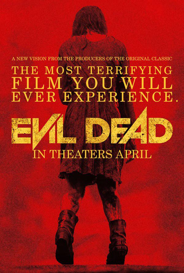
Evil Dead
The Hills Have Eyes / Trajan

This font is used for literally hundreds of horror film posters such as The Conjuring, A Nightmare On Elm Street, The Last House on the Left, The Cabin in the Woods, Sinister and many more.None of these films have done anything exceptionally different with Trajan each time they use it so what makes it suitable? I think it's because of the classic, traditional style the font has, the neutral feel to it allows it to be used on horror posters and look good, where as a sans-serif such as Futura would look hugely out of place. I also think that if a film were to make a typeface that has blood dripping off it or a ghost in the letter O, it would come across as cheap and would put people off seeing it, and now people have become so accustomed to seeing Trajan whether they know it or not, it's just the safe, reliable option.
Overall horror film fonts don't seem to have many styles or characteristics that are common, except for the use of Trajan. Other than this, it seems to be individual to the film what the designer does with the type and how they think the feel of the film will get communicated to the viewer. Things I will take away from this research is that certain letters could be more powerful than others or different letters can cut and overlap one another, as seen in the Evil Dead type. The fonts used in many of these posters aren't as bold and strong as I would have liked, which is a contrast to heavy metal album titles.
No comments:
Post a Comment